This vignette summarizes the basic formatting that the cmapplot
package can add to a ggplot(), including via the functions
theme_cmap(), geom_recessions(),
geom_text_lastonly(), and
apply_cmap_default_aes(). The vignette relies on one of the
sample CMAP datasets included with the package.
The initial plot
Let’s start with a basic time series line graph, drawn using
ggplot2’s default theme (theme_grey()). We’ll save this as
p for later, but keep the actual data geom (in this case,
geom_line()) separate due to how ggplot2 layers geoms.
# load tidyverse (which includes ggplot2) and cmapplot
library(tidyverse)
library(cmapplot)

# clean up dataset
df <- transit_ridership %>%
  filter(system != "pace_ada") %>%
  mutate(system = recode_factor(system,
    cta_bus = "CTA bus",
    cta_rail = "CTA rail",
    metra = "Metra",
    pace = "Pace"
  ))

# build plot
p <- ggplot(data = df,
            mapping = aes(x = year, y = ridership, color = system)) +
  scale_y_continuous(breaks = c(0, 200, 400),
                     limits = c(-1, 575))

p + geom_line()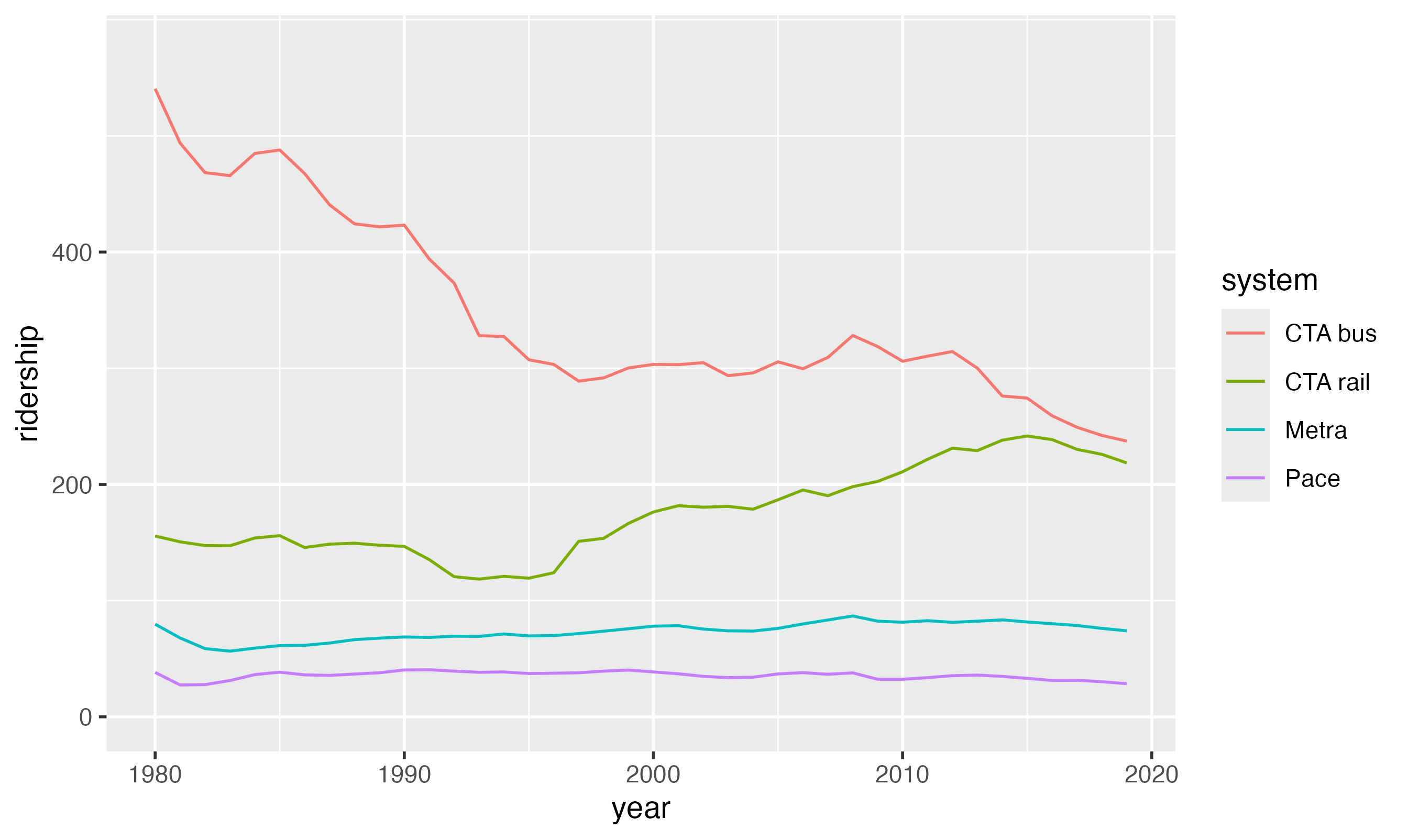
The CMAP theme
Basic implementation
To add basic CMAP design elements to the plot, add
theme_cmap() like you would any other ggplot2 theme.
p + geom_line() + theme_cmap()
#> Warning: The `size` argument of `element_line()` is deprecated as of ggplot2 3.4.0.
#> ℹ Please use the `linewidth` argument instead.
#> ℹ The deprecated feature was likely used in the cmapplot package.
#>   Please report the issue at <https://github.com/CMAP-REPOS/cmapplot/issues>.
#> This warning is displayed once every 8 hours.
#> Call `lifecycle::last_lifecycle_warnings()` to see where this warning was
#> generated.
#> Warning: The `size` argument of `element_rect()` is deprecated as of ggplot2 3.4.0.
#> ℹ Please use the `linewidth` argument instead.
#> ℹ The deprecated feature was likely used in the cmapplot package.
#>   Please report the issue at <https://github.com/CMAP-REPOS/cmapplot/issues>.
#> This warning is displayed once every 8 hours.
#> Call `lifecycle::last_lifecycle_warnings()` to see where this warning was
#> generated.
Built-in modifiers
The CMAP theme function has a variety of easy built-in modifiers. For
example, by default the x- and y-axis labels are turned off, but this
can be overridden. The help file ?theme_cmap describes how
to make these changes.
For example, theme_cmap() can be used to to add a strong
horizontal or vertical line (such as to delineate zero or some other
threshold). Note that, on standard-resolution (non-retina) displays,
hline and vline may appear as the same
thickness as the plot’s gridlines when viewed within R. When exported as
a vector file (or raster at high enough resolution) the difference
becomes apparent.
When using hline and/or vline, it is
important to place theme_cmap() before the primary
data geom. This is because the hline drawn by
theme_cmap() is a geom, and ggplot2 layers geoms in the
order they are added to the plot. This ordering allows the
CTA rail line to be drawn on top of the
hline.
p + theme_cmap(ylab = "Annual Ridership (Millions)",
               hline = 200, # may not be immediately visible
               legend.max.columns = 2) +
  geom_line()
#> Warning: Using `size` aesthetic for lines was deprecated in ggplot2 3.4.0.
#> ℹ Please use `linewidth` instead.
#> ℹ The deprecated feature was likely used in the cmapplot package.
#>   Please report the issue at <https://github.com/CMAP-REPOS/cmapplot/issues>.
#> This warning is displayed once every 8 hours.
#> Call `lifecycle::last_lifecycle_warnings()` to see where this warning was
#> generated.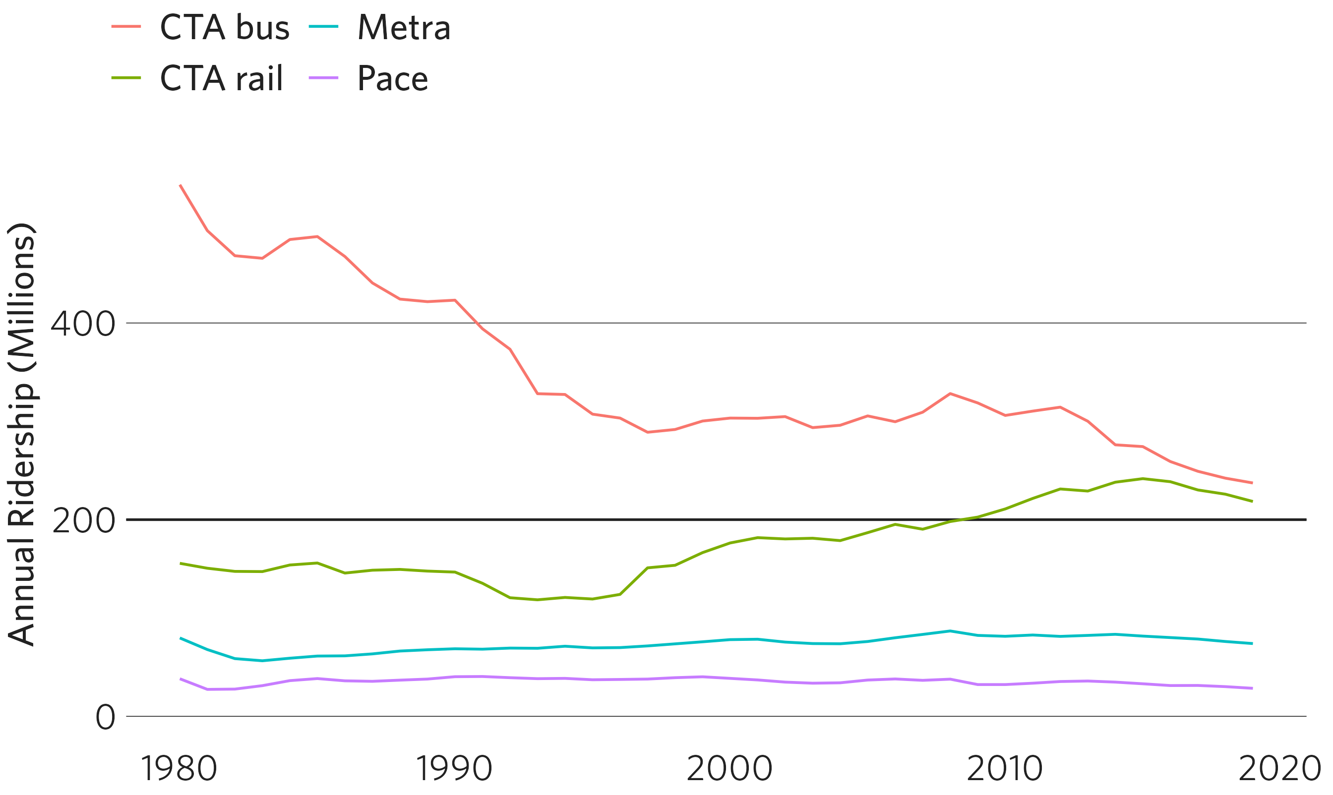
theme_cmap() also allows users to easily add tick marks
on the x- and/or the y-axes, using the argument axisticks.
Note that here, some additional manipulation of the y-axis scale is
necessary for the axis ticks to touch the lowest horizontal gridline
(this is to override ggplot2’s default behavior, which
expands the scale slightly beyond the extent of the data for aesthetic
reasons).
p + geom_line() +
  scale_y_continuous(breaks = c(0, 200, 400),
                     limits = c(-1, 575),
                     expand = c(0, 0)) +
  theme_cmap(ylab = "Annual Ridership (Millions)",
             axisticks = "x")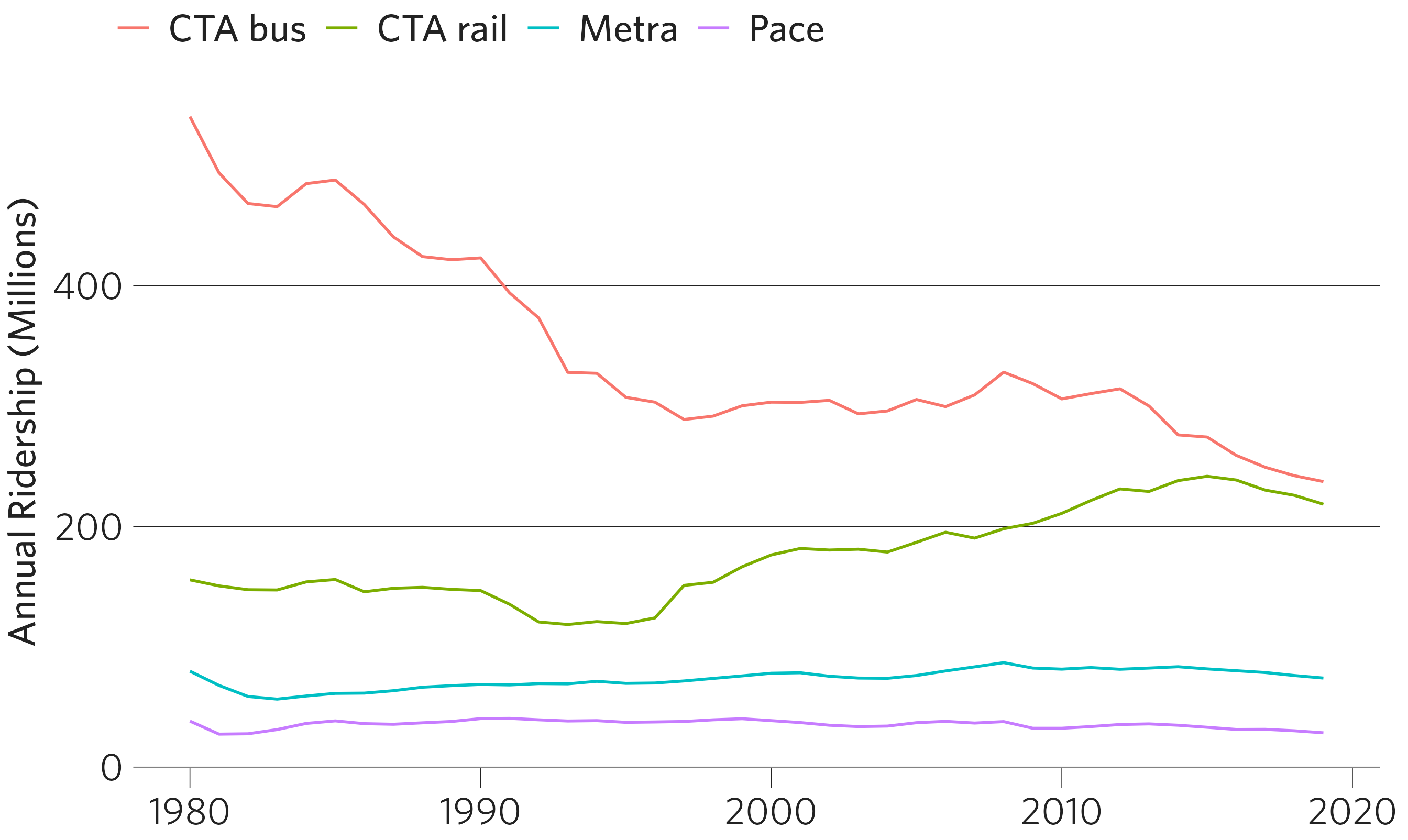
Overriding plotting defaults
The package contains a list of default values
(cmapplot_globals$consts) that control various plotting
constants. Most of these impact the function
finalize_plot(), but a few impact
theme_cmap(). For a complete description of these
constants, see ?cmapplot_globals.
The most important at this stage is margin_panel_r,
which controls the distance between the right side of the plot and the
right side of the plotting window. Depending on the length and location
of your right-most x axis label, you may need to expand this value
beyond it’s default. These consts can be modified in the
overrides argument:
p + scale_x_continuous(labels = c("1980", "1990", "2000", "2010", "2020", "A very long label")) +
  theme_cmap(ylab = "Annual Ridership (Millions)",
             hline = 200,
             overrides = list(margin_panel_r = 50, # the most likely override in theme_cmap()
                              lwd_strongline = 3)) +
  geom_line()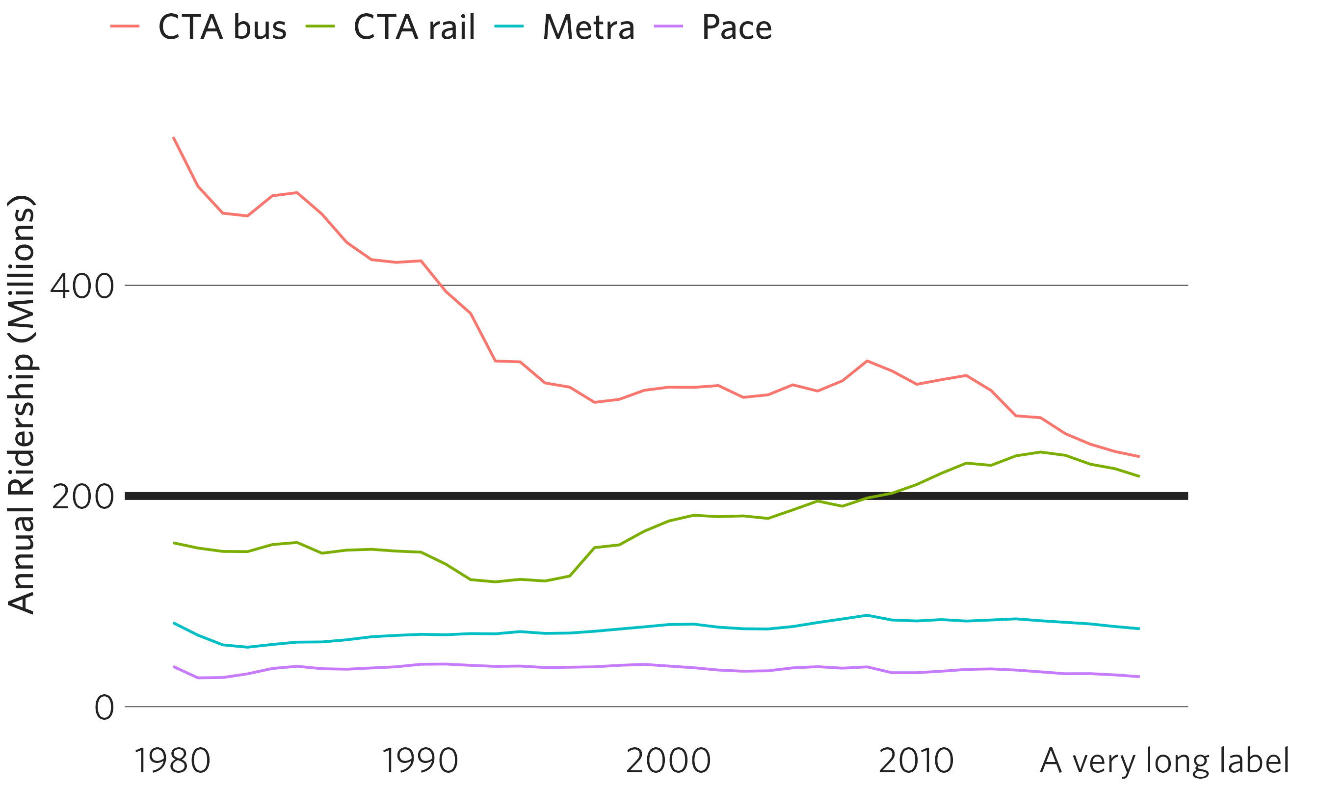
Further theme modifications
In addition, any ggplot2 theme element can also be modified directly
in theme_cmap() by passing valid arguments from the
ggplot2::theme() function. In the following example, the
addition of
panel.grid.major.y = element_line(color = "light gray")
modifies the default color of a horizontal grid line, changing it from
black to light gray.
p + theme_cmap(ylab = "Annual Ridership (Millions)",
               panel.grid.major.y = element_line(color = "light gray")) +
  geom_line()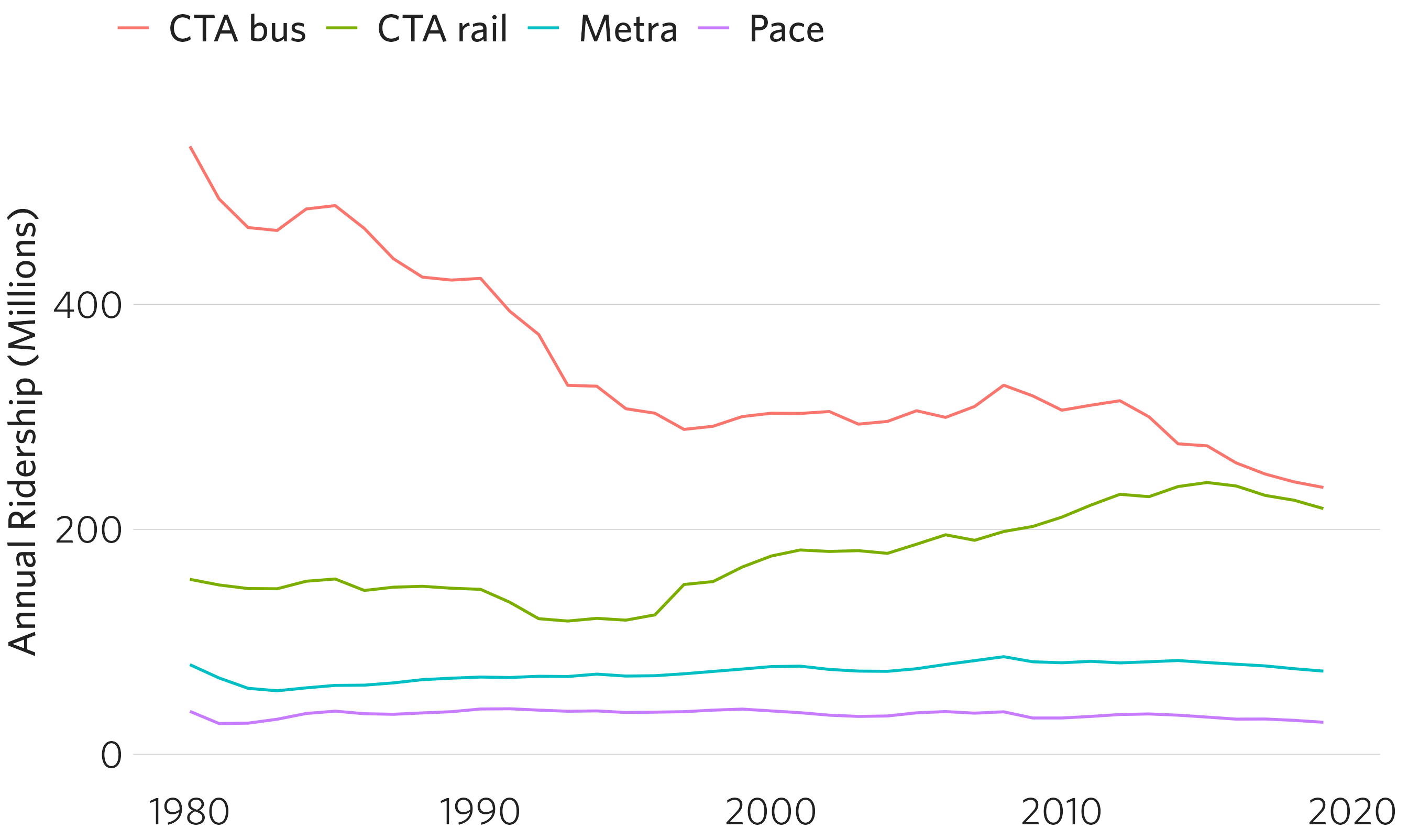
Auxiliary functions
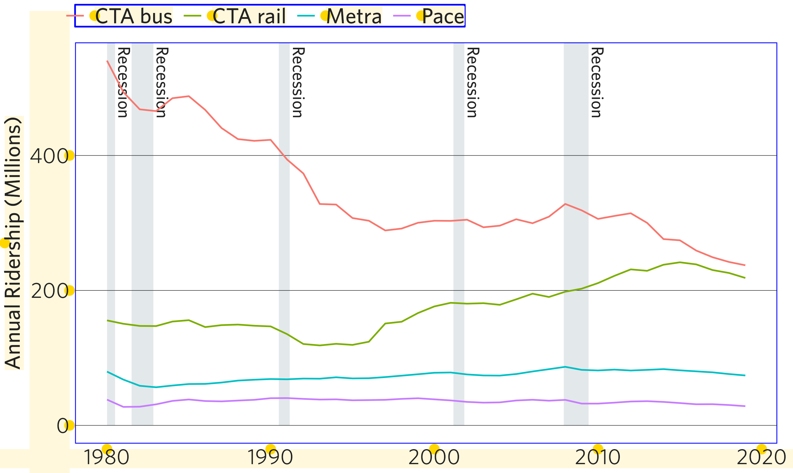
The cmapplot package also includes two custom geoms that allow the user to easily add common elements used in CMAP plots that would be otherwise difficult to program.
Include US recessions as a backdrop
The function geom_recessions(), allows for the addition
of rectangles (and text, if desired) representing US economic
recessions. Similar to the hline example above,
geom_recessions() should be added before the plot’s primary
geom (geom_line()) so that lines are drawn on top of
recession rectangles.
ggplot() always draws geoms on top of base plot
elements like gridlines. The default fill and alpha values for
geom_recessions() are the most transparent way possible to
achieve CMAP palette color #002d49 when drawn on a white
background — thus impacting the color of the gridlines as little as
possible.
This function relies on the National Bureau of Economic Research’s
definitions of recessions. Details on how to update these dates, as well
as how to provide your own, can be found in
geom_recessions() and update_recessions(). If
the most recent recession has not yet been declared over (as is the case
in June 2021), the function will default to displaying this ongoing
recession from its beginning through the end of the visualized data. If
this is not desired (for example, if the visualization is of a
projection far into the future), users can remove this ongoing recession
by setting show_ongoing = FALSE.
q <- ggplot(data = df,
            mapping = aes(x = year, y = ridership, color = system)) +
  geom_recessions(ymin = 0) +
  geom_line() +
  theme_cmap(ylab = "Annual Ridership (Millions)")

q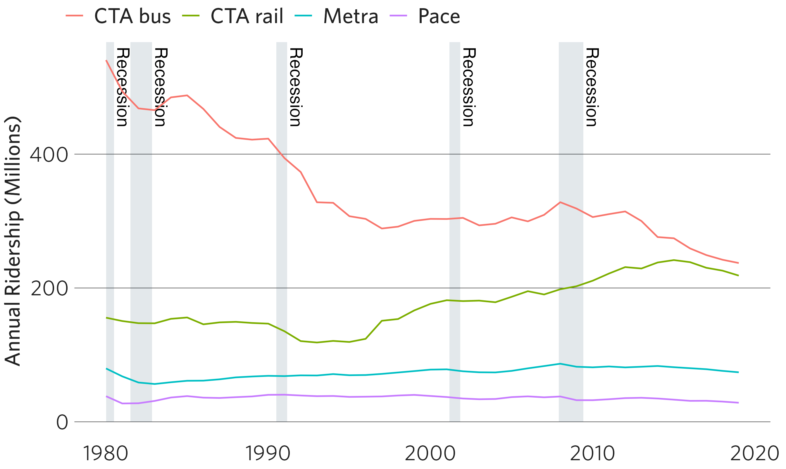
Label and highlight final data point
The function geom_text_lastonly() allows the user to
label only the final point in a time series. In addition to applying the
label, this function can also highlight the final point via an implicit
geom_point(). Like geom_text(), the value of
the label can be passed via the mapping argument, either in
the top-line ggplot() or in
geom_text_lastonly().
Due to ggplot2’s underlying structure, geom_text()
labels are clipped by the plot’s default extent. Often, the right side
of the plot will need to be expanded — or plot clipping turned off — for
correct display of these labels. ?geom_text_lastonly
describes a number of methods to account for this.
q <- q + geom_text_lastonly(mapping = aes(label = round(ridership, digits = 0)),
                            add_points = TRUE,
                            nudge_x = 0.5) +
  coord_cartesian(clip = "off")

q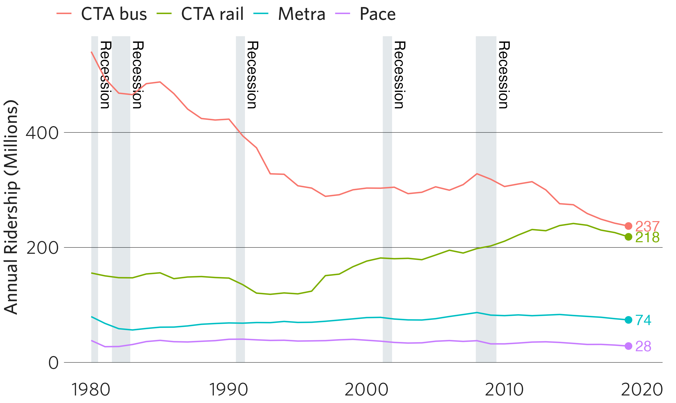
Abbreviating years in date axes
By default, date axes with units in years display the full year for
each axis label (e.g., 2000, 2001, 2002, 2003). In some cases, users may
want to abbreviate some, but not all, of these axis labels, such as by
maintaining the full year for the first label and abbreviating
subsequent labels (e.g., 2000, ’01, ’02, ’03). The function
abbr_years enables users to do so, defaulting to
abbreviating all years but the first.
This function uses syntax similar to those in the
scales::label_*() family, and can be applied to a plot via
the labels parameters of the ggplot2::scale_x_continuous or
ggplot2::scale_x_date() functions (or their y-axis
counterparts). Users can specify which years should be abbreviated by
either their value (using full_by_year) or their position
on the axis (using full_by_pos). More details are available
in ?abbr_years.
p + geom_line() + theme_cmap() +
  scale_x_continuous(labels = abbr_years(full_by_year = c(2000)))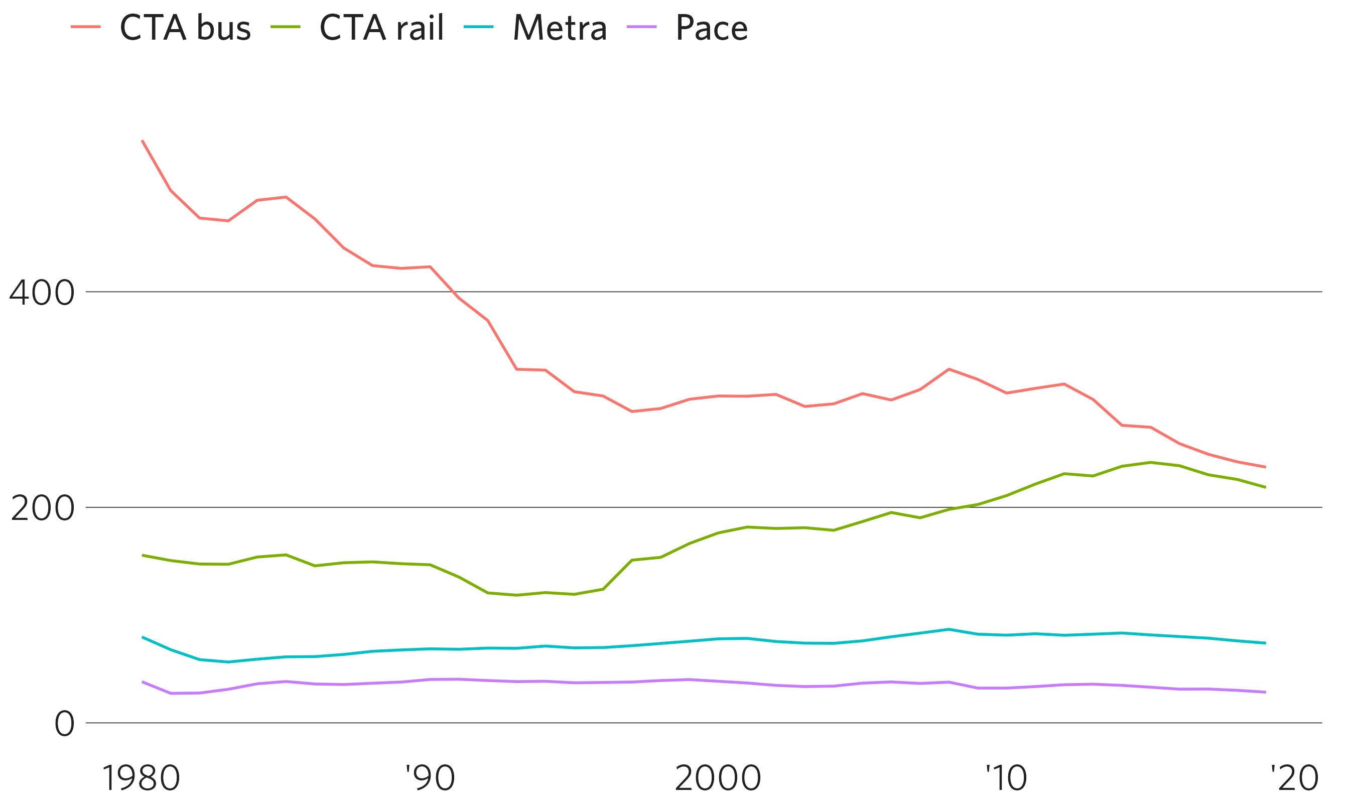
Applying CMAP default aesthetics
Every ggplot2 “geom” has default aesthetics that cannot be modified
by a ggplot2 theme (and therefore, cannot be modified by
theme_cmap()). Notice, for example, that the text drawn in
the plot via geom_text_lastonly() and
geom_recessions() still appears in Arial (R’s default
font), although the legend and axis fonts appear in Whitney. This is
automatically corrected in finalize_plot(). However, if
you’d like to see these impacts at this stage, you can override
ggplot2’s default aesthetics for line and text geoms with CMAP defaults
via apply_cmap_default_aes().
apply_cmap_default_aes()
#> Aesthetic defaults overridden in the current session for the following Geoms:
#>   Label, Line, Text, TextLast, TextLastRepel, PointLast, RecessionsText, PandemicsText
#> To undo this change, run `unapply_cmap_default_aes()`.

q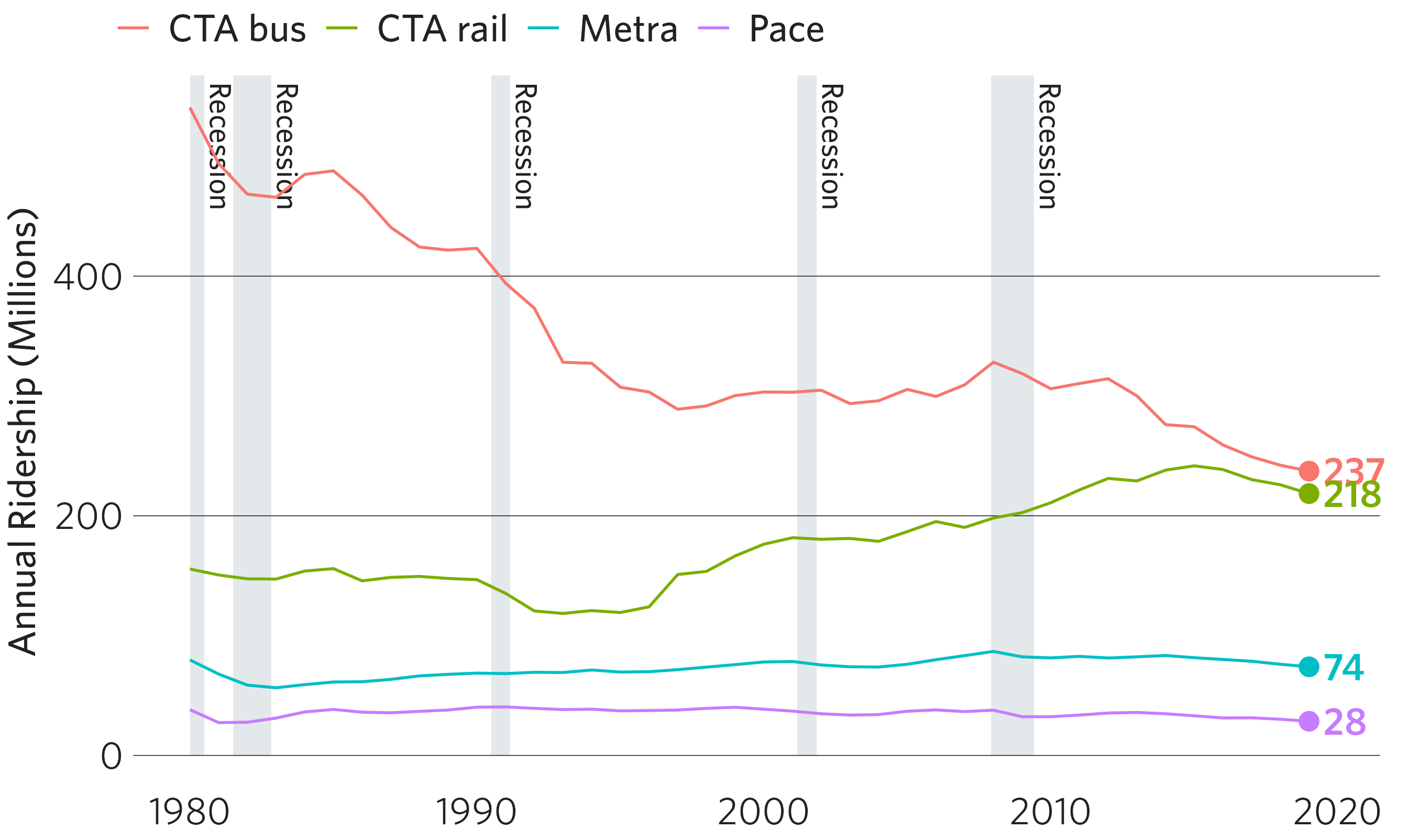
It is important to note that this change is “sticky” for the duration
of the session, but you can reverse the change with
unapply_cmap_default_aes(). This function will revert to
whatever the default aesthetics were before cmapplot was loaded.
Debug mode
In addition, theme_cmap() provides a debug mode in which
it draws outlines around the rectangular elements in the plot. This can
help the user understand what is being drawn and identify additional
modifications that they might want to make via overrides or
ggplot2::theme() arguments:
ggplot(data = df,
       mapping = aes(x = year, y = ridership, color = system)) +
  geom_recessions(ymin = 0) +
  geom_line() +
  theme_cmap(ylab = "Annual Ridership (Millions)",
             debug = TRUE)