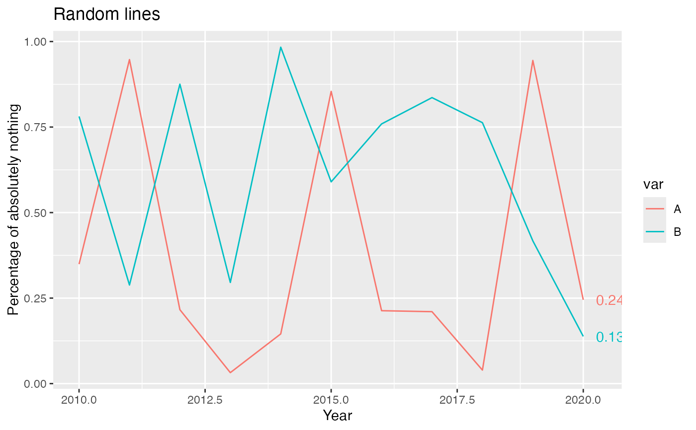
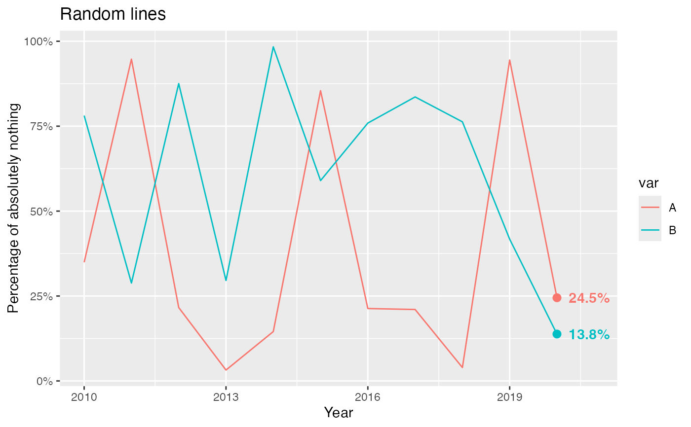
Label only the last point(s) on a plot. geom_text_lastonly() can be
used instead of ggplot2::geom_text() when only the last point(s)
should be labeled. This is accomplished by identifying the maximum value of
x in data and applying a filter to omit records where x
is less than the maximum.
geom_text_lastonly(
  mapping = NULL,
  data = NULL,
  stat = "identity",
  position = NULL,
  parse = FALSE,
  nudge_x = 0.25,
  nudge_y = 0,
  check_overlap = FALSE,
  na.rm = FALSE,
  show.legend = FALSE,
  inherit.aes = TRUE,
  add_points = FALSE,
  text_aes = NULL,
  point_aes = NULL,
  ...
)
Arguments
- mapping
Set of aesthetic mappings created by
aes(). If specified andinherit.aes = TRUE(the default), it is combined with the default mapping at the top level of the plot. You must supplymappingif there is no plot mapping.- data
The data to be displayed in this layer. There are three options:
If
NULL, the default, the data is inherited from the plot data as specified in the call toggplot().A
data.frame, or other object, will override the plot data. All objects will be fortified to produce a data frame. Seefortify()for which variables will be created.A
functionwill be called with a single argument, the plot data. The return value must be adata.frame, and will be used as the layer data. Afunctioncan be created from aformula(e.g.~ head(.x, 10)).- stat
The statistical transformation to use on the data for this layer. When using a
geom_*()function to construct a layer, thestatargument can be used to override the default coupling between geoms and stats. Thestatargument accepts the following:A
Statggproto subclass, for exampleStatCount.A string naming the stat. To give the stat as a string, strip the function name of the
stat_prefix. For example, to usestat_count(), give the stat as"count".For more information and other ways to specify the stat, see the layer stat documentation.
- position
Position adjustment, either as a string, or the result of a call to a position adjustment function. Cannot be jointy specified with
nudge_xornudge_y.- parse
If
TRUE, the labels will be parsed into expressions and displayed as described in?plotmath.- nudge_x, nudge_y
Horizontal and vertical adjustment to nudge labels by. Useful for offsetting text from points, particularly on discrete scales. Cannot be jointy specified with
position.- check_overlap
If
TRUE, text that overlaps previous text in the same layer will not be plotted.check_overlaphappens at draw time and in the order of the data. Therefore data should be arranged by the label column before callinggeom_text_lastonly().- na.rm
If
FALSE, the default, missing values are removed with a warning. IfTRUE, missing values are silently removed.- show.legend
logical. Should this layer be included in the legends?
NA, the default, includes if any aesthetics are mapped.FALSEnever includes, andTRUEalways includes. It can also be a named logical vector to finely select the aesthetics to display. To include legend keys for all levels, even when no data exists, useTRUE. IfNA, all levels are shown in legend, but unobserved levels are omitted.- inherit.aes
If
FALSE, overrides the default aesthetics, rather than combining with them. This is most useful for helper functions that define both data and aesthetics and shouldn't inherit behaviour from the default plot specification, e.g.annotation_borders().- add_points
If
TRUE, points will be added to the plot (for the labeled data only). Default size=2, color will match line color.- text_aes, point_aes
Named list, additional aesthetics to send to the text and point geoms, respectively.
- ...
Additional aesthetics to send to BOTH the point and text geoms. Note that if
add_points = FALSE, additional parameters can be passed to the text geom here, rather than intext_aes, without breaking.
Details
Labels are placed by default to the right of the final point, and may be partially cut off by the plot limits. There are two known ways to address this:
Turn off panel clipping, e.g. with
coord_cartesian(clip = "off"). Substitute the correct coordinate system for your plot–all have aclipargument available. Note that this will allow all geoms in the plot to draw outside the panel area, which may have unintended consequences.Manually expand the
xscale, e.g. withscale_x_continuous(expand=expand_scale(mult=0.10))orcoord_cartesian(xlim = c(min, max)).
Code was mostly copied from the source of ggplot2::geom_text() and
ggplot2::geom_point().
Examples
df <- data.frame(year=2010:2020, value=runif(22), var=c(rep("A", 11), rep("B", 11)))

# Without points, label formatting or x-axis expansion
ggplot(df, aes(x=year, y=value, color=var)) +
  geom_line() +
  labs(title="Random lines") +
  scale_y_continuous("Percentage of absolutely nothing") +
  scale_x_continuous("Year") +
  geom_text_lastonly()


# With points, label formatting and x-axis expansion
ggplot(df, aes(x=year, y=value, color=var, label=sprintf("%.1f%%", 100*value))) +
  geom_line() +
  labs(title="Random lines") +
  scale_y_continuous("Percentage of absolutely nothing", labels=scales::percent) +
  scale_x_continuous("Year", expand=expansion(mult=c(0.05, 0.10))) +
  geom_text_lastonly(add_points=TRUE, text_aes=list(fontface="bold"), point_aes=list(size=2.5))
