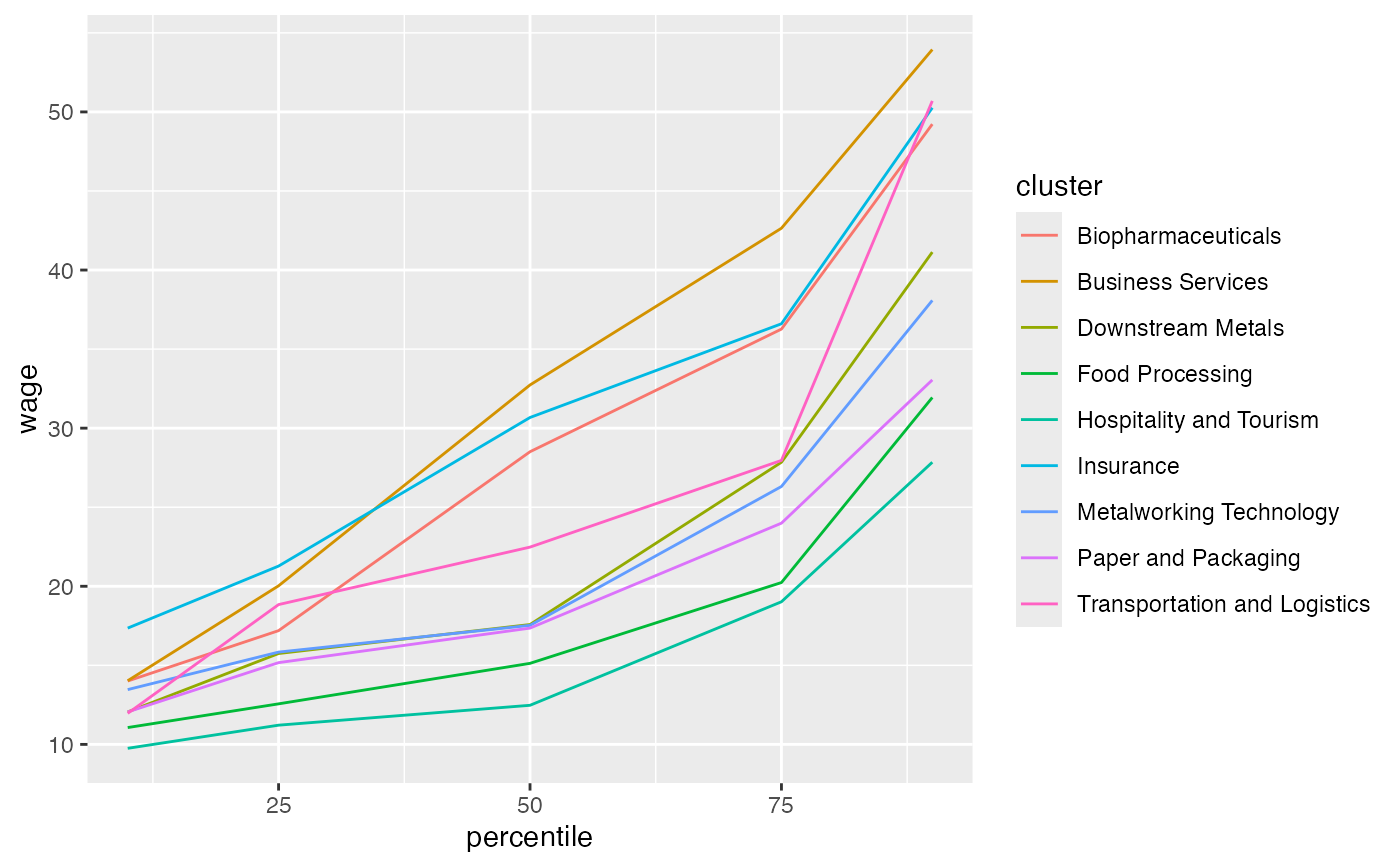
A test dataset containing the 10th, 25th, 50th, 75th, and 90th percentile wage by cluster in the CMAP region.
percentile_wagesFormat
A tibble. 45 rows and 3 variables:
- cluster
Chr. The name of the cluster
- percentile
Double. The percentile wage being reported
- wage
Double. The wage. I believe 2017 data.
Source
CMAP traded clusters report